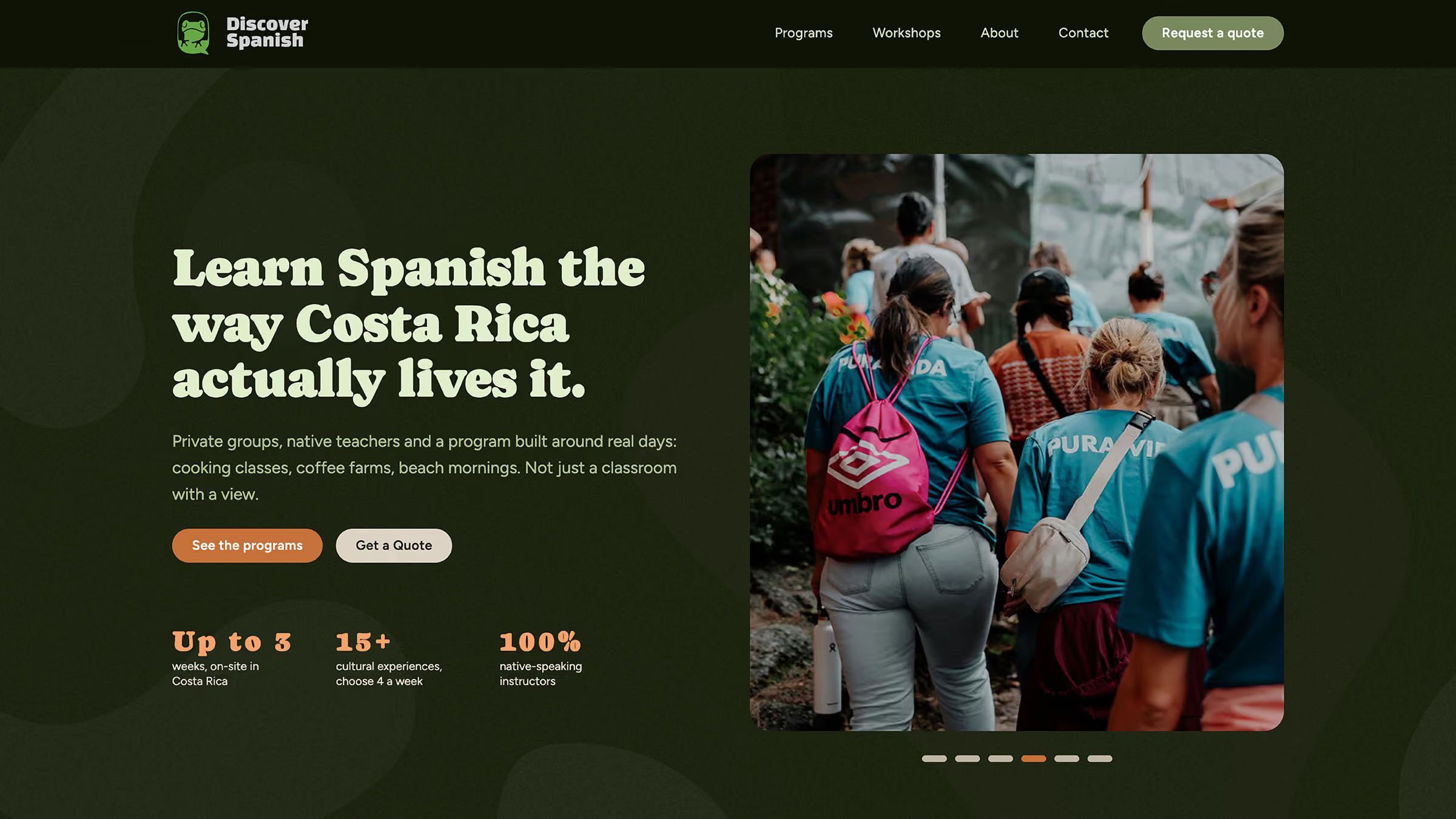
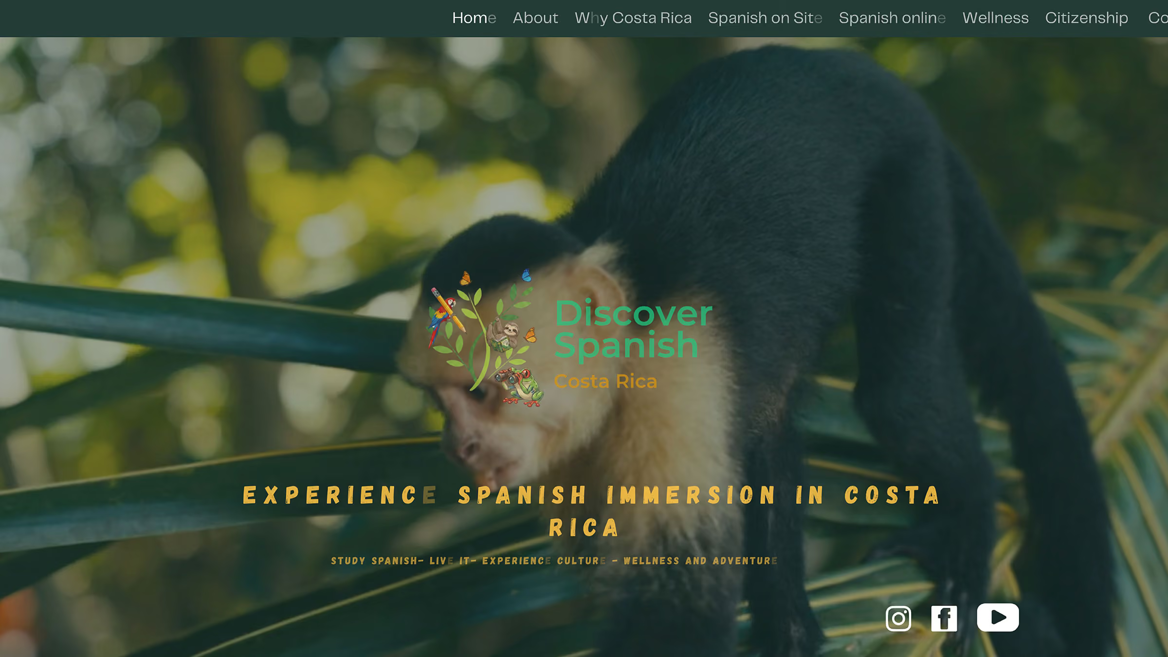
Discover Spanish was a new business with no clients yet, run by two people. It had a name, a first logo and a website made in Canva. The product is not cheap, and the Canva site could not carry it: it looked improvised, and the texts described a nomadic, multi-destination trip that the team could not operate.
The founders first asked me for advice. As we talked, we found strategic and communication problems in the product itself, and they asked me to build the site. So the work started before the design: shaping the programs and the message, and then the brand.
Constraints: a tight budget, no photos or video of their own yet, a brand that existed only as text, content still being written, a two-person team and English as the only teaching language.
I reviewed six established Spanish schools in Costa Rica. They follow the same format: around 20 hours of class per week, cultural activities included and optional homestay, at a similar price. Several already offer yoga or surf, so “light wellness” does not make a difference. Wellness retreats, on the other side, do not teach Spanish.
The buyers are groups, not individuals: university faculty-led programs, lifelong learning groups for older adults and private groups of friends and family. Each one asks something different before writing:
Same format, same price. The client already had the idea of mixing classes, culture and rest. I structured it into three pillars, Learn, Live and Rest, and made it the core message: the three happen in the same week, not as separate add-ons.
Every program is quoted for a specific group, so a checkout made no sense. The main conversion is a quote form with the fields a group organizer needs: institution, group size from 5 to 12 and program length.
The product teaches Spanish, but it works like a tour operator. The client first asked for Shopify, a retail platform. I proposed Webflow with a CMS they can update, ready to add bookings with a travel platform like WeTravel later, without rebuilding the site.
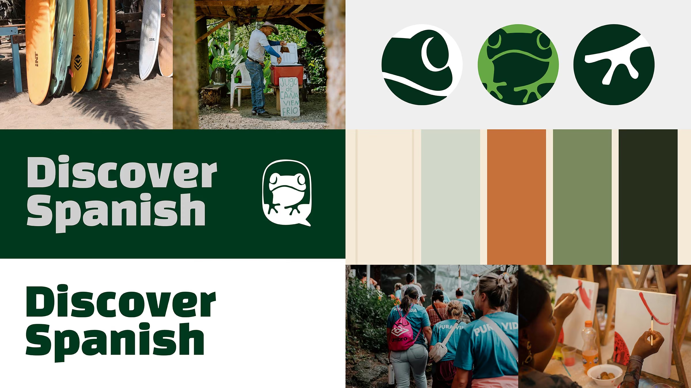
Costa Rica is known as a green country in every sense, and the idea was to welcome people the same way while they learn Spanish. My reference was a joyful way to present learning, with a lot of personality. Our palette is calmer, but the goal was the same: to give the brand a real character.
As a gift, I designed a small brand book and applied it directly to the site: a new color palette, a completely new frog mark, a new logo typeface and a design system for the brand.
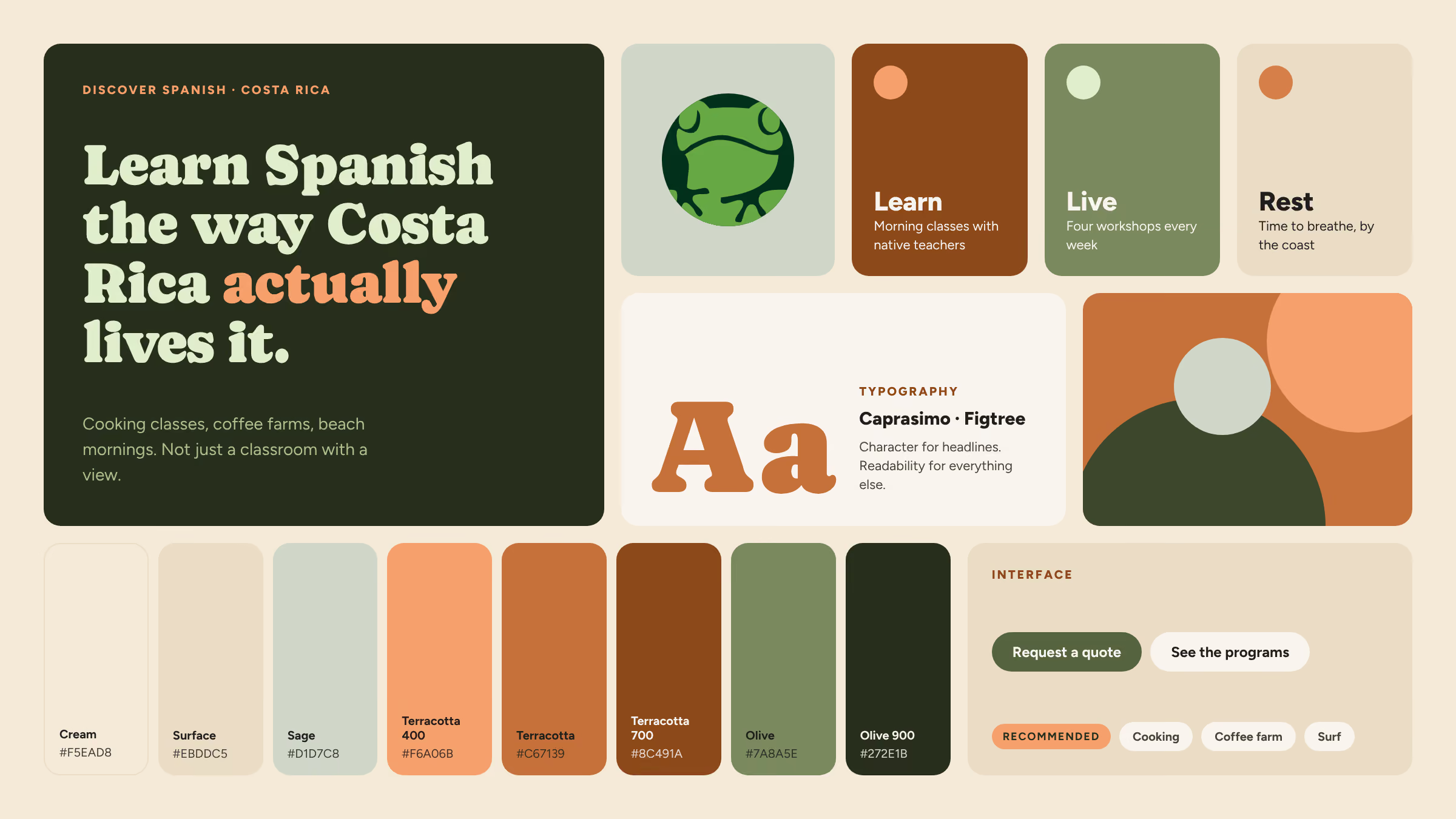
Palette: warm cream backgrounds, terracotta and olive as the two brand colors, each with a full ramp, and sage for quieter sections.
Typography: Caprasimo for headlines, for character, and Figtree for everything else, for readability. Card titles use Figtree 800, never small Caprasimo.
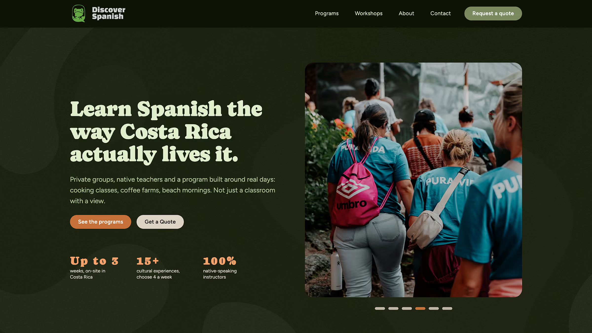
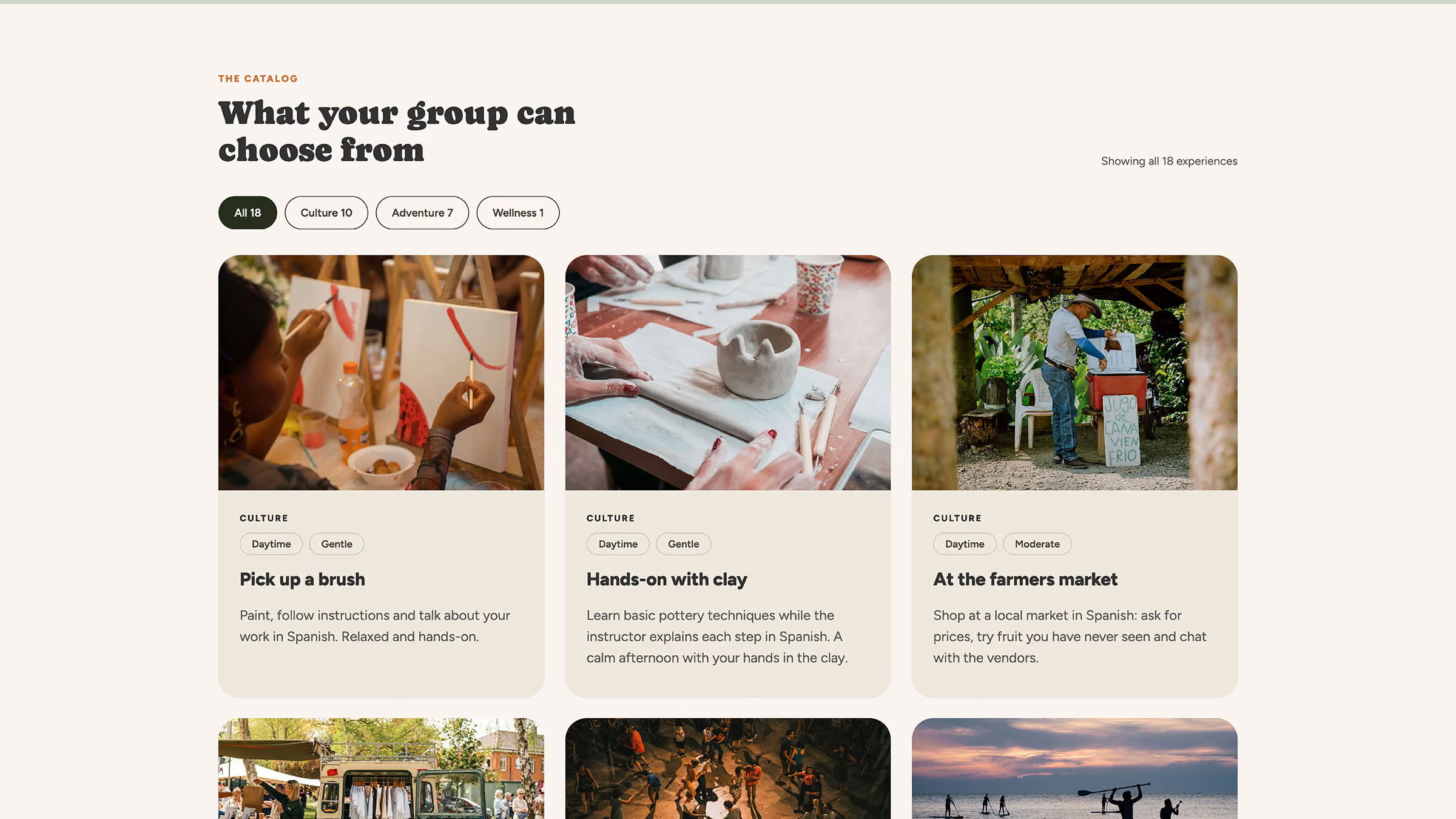
Photography: the photos had to show real life. Most people are not expert painters or good with clay, so we chose each workshop photo with that in mind: regular people trying something new, not professionals. When possible, the photo also shows a group. Programs are made for groups of up to 12 people, so the experience is a shared one.
Tone of voice: English, short and concrete, naming what people will actually do: “Cooking classes, coffee farms, beach mornings. Not just a classroom with a view.” I wrote the copy from the client's information, using AI to speed up drafts and edits.
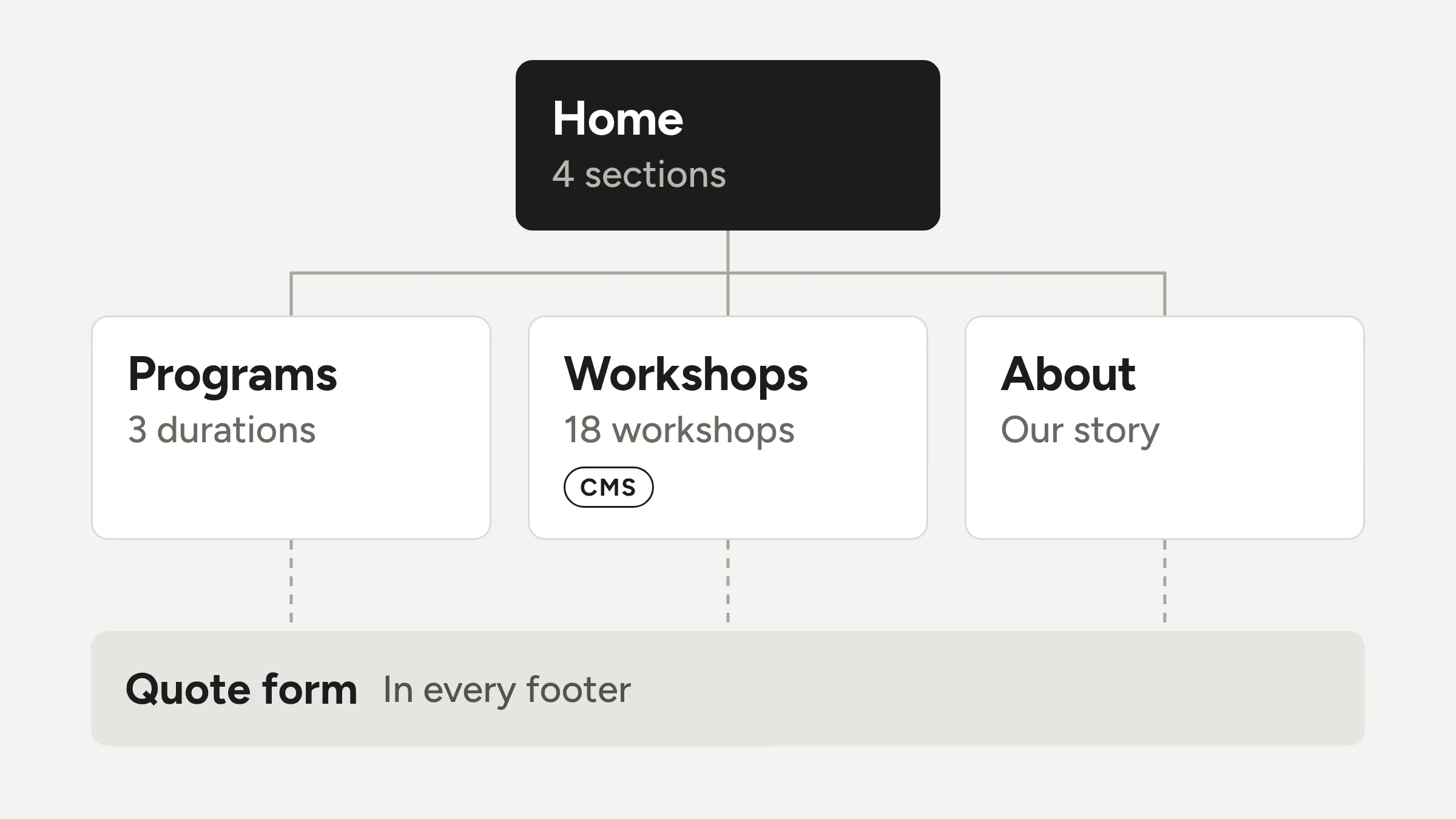
Sitemap: Home · Programs · Workshops · About · Contact. Programs and Workshops live in the CMS, so the client can add durations and activities without touching the design.
The Home answers what a group organizer asks, in order:
1. Hero with video and key numbers · What is this, and is it for our group?
2. Learn, Live, Rest · What makes it different?
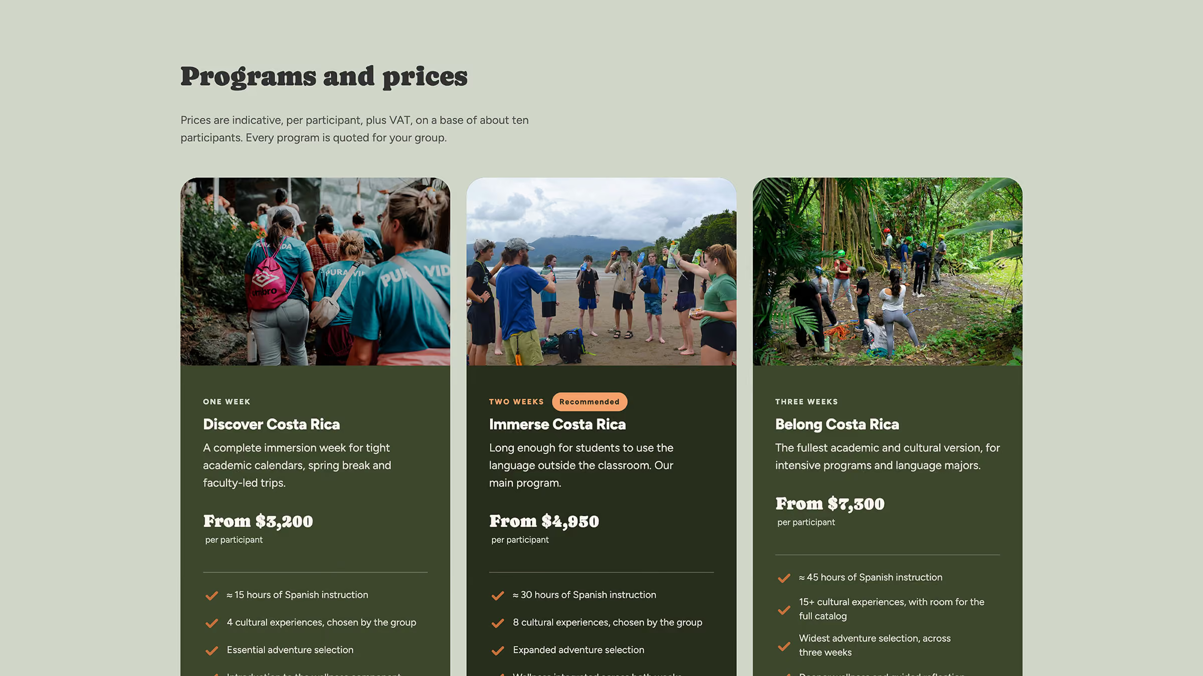
3. Programs, with the two-week option marked as recommended · How long, and what is included?
4. Quote form · How do we start?
Every call to action leads to the same quote form.
I started with low-fidelity wireframes of the four main pages. They worked as a map of what content I needed from the client. From there I went straight to an HTML and CSS prototype, and then to the Webflow build, without a separate mid-fidelity step. I presented one direction to both founders, who approved together, in two review rounds.
What I held. The visual identity. The first logo and the Canva site did not match the product, so the new brand system went into the site complete, not in pieces.
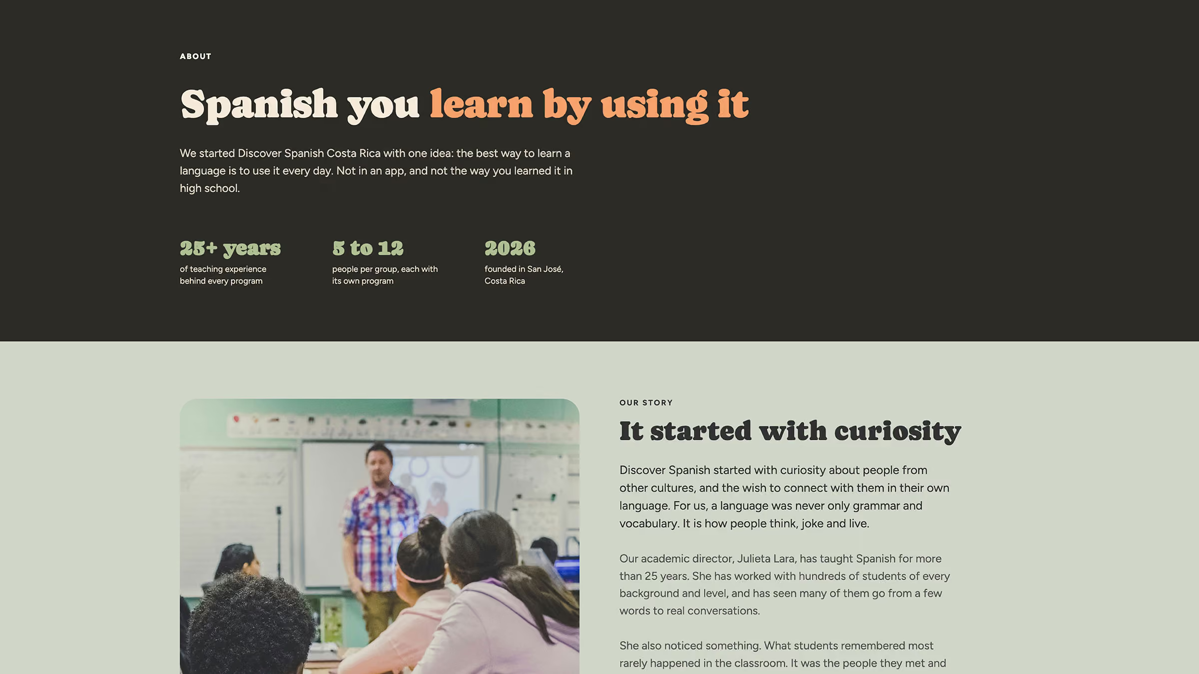
What we adjusted. The client's corrections made the product clearer. Workshops are part of every week, four per week, and only the topic is optional. The program has a fixed base instead of moving around the country. And the site is in English only, because that is the language the team teaches from. On the About page, the text was long and repeated the same idea many times, so I cut it down and kept the founders' real story.
1. A quote site, not a store. The client does not sell online, and each program is priced for a specific group.
2. Webflow with a CMS, bookings later. A two-person team needs to update the site alone, and it has to grow without being rebuilt.
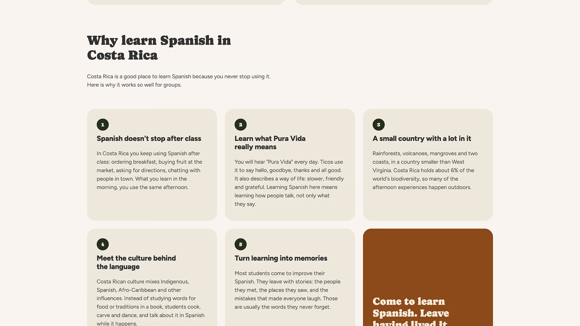
3. One message in three pillars. Learn, Live and Rest, so the program is not one more interchangeable school.
4. The two-week program as “Recommended”. It is the option the client recommends, and it helps groups decide faster.
5. A build system before pages. Base classes plus combos, so every new page stays consistent.
The brand system lives in Webflow as variables and documented tokens:
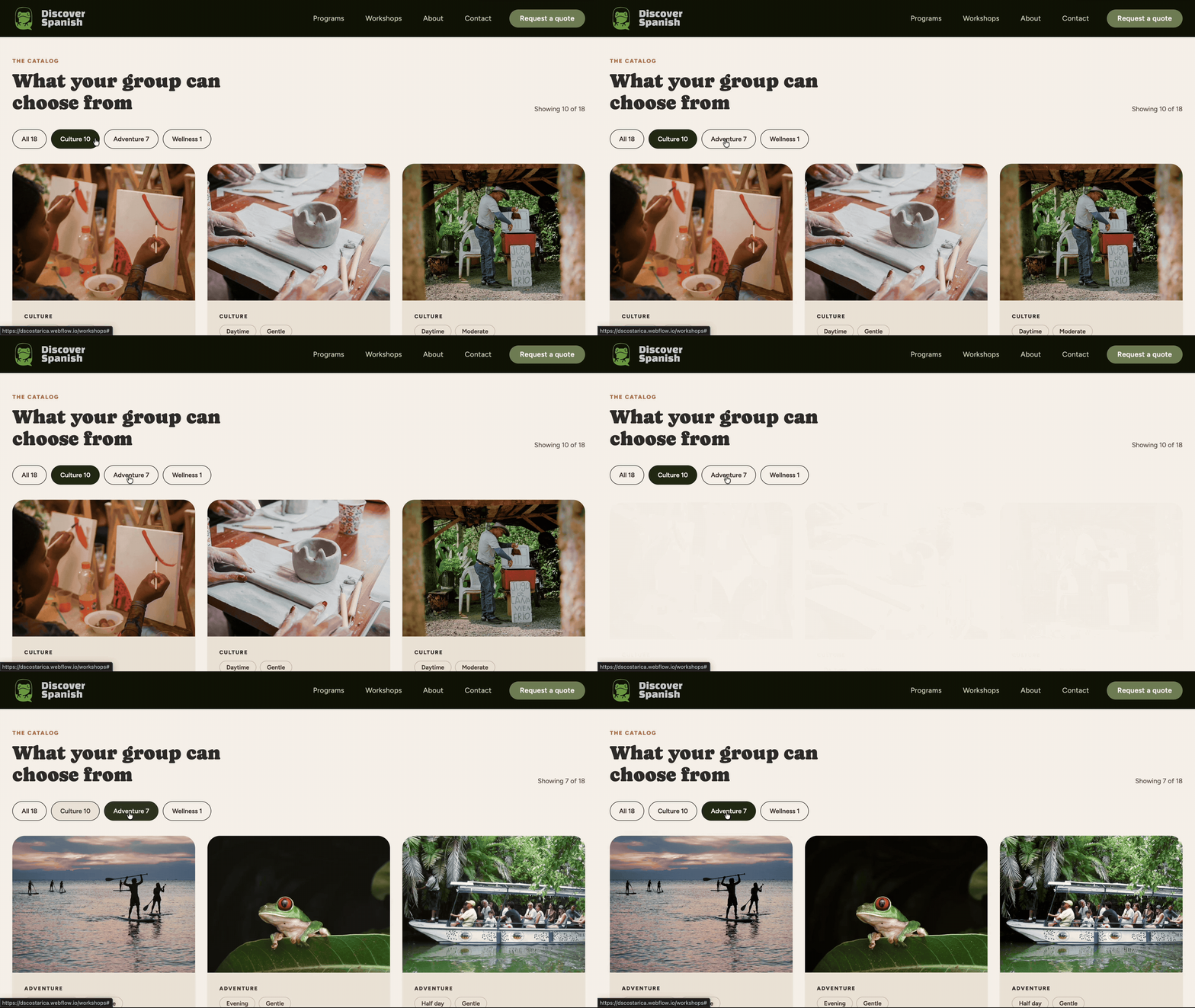
The 18 workshops live in a CMS catalog with filters by category (Culture, Adventure, Wellness), intensity (Gentle, Active, Demanding) and duration.
Intensity answers a real question from groups of older adults: how demanding is this? And the client can add new workshops and categories without touching the design.
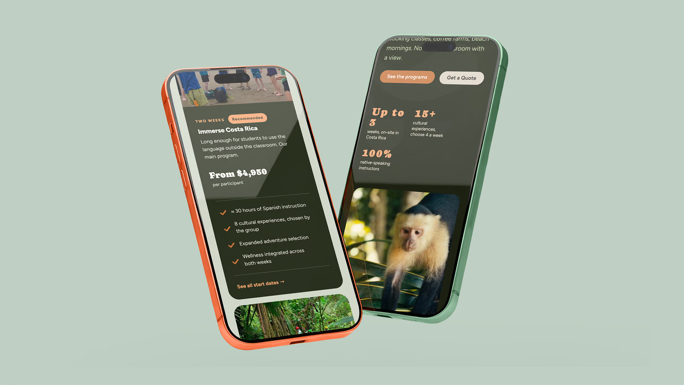
Groups plan by month. On desktop, start dates are a table. On mobile, the table turns into cards with the month as the title, and a toggle shows the next 12 months only when needed.

On mobile, every grid moves to one column and the staggered pillar cards line up. The menu becomes a hamburger, and the navigation buttons are repeated inside it so the quote is always one tap away.
Motion: the hero slider plays each video to the end before moving on, and shows each image for five seconds. Videos are muted and inline so they play on phones, and the slider respects reduced motion settings. The 12-month toggle uses aria-expanded for screen readers.


I built the site in Webflow: CMS collections for workshops and programs, a native form for quotes and a custom script for the hero slider.
For SEO, every page has structured data connected by ID (organization, courses, workshops, people and contact), plus an llms.txt file so AI search tools can read the site. Accessibility basics are built in: visible focus states, reduced motion and labeled form fields.
The hardest part was guiding the client while the product was still being defined.
The brand existed only as text, and the logo changed completely during the project, so I designed the site and the identity at the same time. Advising them first is what made the rest possible.