Grupo SG sells machinery, supplies, software and technical service for offset, flexography, inkjet, textile, 3D and dental 3D printing, in more than 10 countries. It was the most complete supplier in its category in the region, but online it did not show.
The brand was scattered. In several countries the company was still known by older names, like Sommerus or Eurotrading, and Google showed both names. On the home page, the Heidelberg logo had the same size as the SG logo and the main video was from Heidelberg. Heidelberg's own guidelines ask its dealers to use their own identity.
The website had no goal. The copy used vague words like “innovación” (innovation) and “impresión” (printing), which placed SG as a printing service, not a machinery supplier. The site had more than 2,000 URLs, at least 100 broken links and duplicated slugs. There were two online stores, and the one in Costa Rica had never sold anything.
The business goal: keep the leadership in offset and bring the other business lines to the same level, as part of a strategic plan to 2030.
Before designing anything, we crossed four sources:
1. Site audit with five lenses: structure and experience, content and value, navigation, web branding and conversion. Plus a technical SEO review: headings, slugs, sitemaps, backlinks and page weight.
2. One year of data in Google Analytics, and keyword positions in Mexico, Costa Rica and Guatemala.
3. Benchmark of 15 competitors by business line and 7 best practice references outside the industry, like Hilti and DHL.
4. 15 interviews of one hour with sales, management and technical service in Costa Rica, Guatemala, Nicaragua, El Salvador and Panama, including the CEO.
The data was clear: 74% of the 24,434 yearly sessions left without browsing, only 25% of home visitors interacted with the page, and the average time per section was 35 seconds. We explained it to the client with a simple image: the National Stadium is full with 35,000 people, they stay 13 seconds, and only 14 stay for the concert.
In offset, about 25 key clients make 80% of the business, and a big machine can take up to 10 years to sell. What keeps those clients is technical service. One manager said it simply: “Primero hay que arreglar al cliente y luego a la máquina” (First you fix the client, then the machine). The old site did not show it anywhere.
The SG site had no catalogs or technical sheets, so salespeople sent clients to the manufacturers' websites. The new lines, like 3D and dental, sell to a younger audience that searches online, and they told us: “No existimos en la página” (We don't exist on the website).
In every line and in every interview, the team described Grupo SG the same way: “Con Grupo SG cualquier empresa tiene todo lo que necesita para crecer: maquinaria, servicio técnico e insumos” (With Grupo SG any business has everything it needs to grow: machinery, technical service and supplies). We did not need to invent a concept. We needed to give it a name and make it visible.
The concept came from the interviews. In every business line, people explained Grupo SG with the same idea: with Grupo SG, any business has everything it needs to grow, from machinery to technical service and supplies. We turned that idea into “One-stop partner. Un solo proveedor, todas las soluciones” (One-stop partner. One supplier, every solution), because it is what really explains Grupo SG in each of its lines. This concept organized the brand, the site structure and the content.
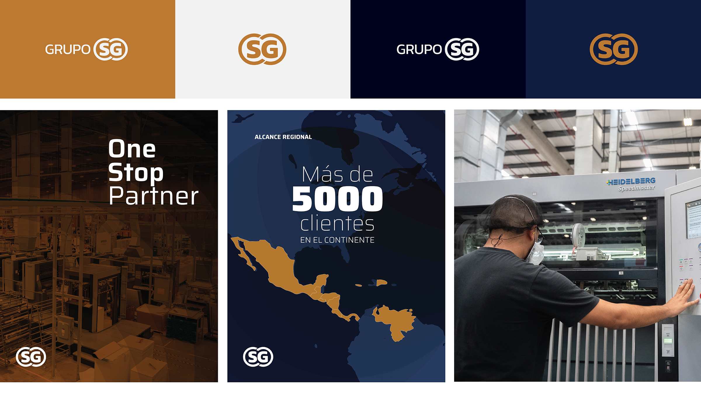
Logo: we presented three levels of change, from a simple cleanup to a new abstract symbol. The client chose an evolution: keep the gold rings as a sign of legacy, take weight away from “Grupo” (Group), a generic word, and make “SG” (SG) the main element. The isotype works alone in small spaces and social media.
Palette: a deep navy base with gold from the rings as the accent color.
Digital visual system: clean backgrounds that let the machines stand out, the isotype always present, strong contrast in type hierarchy, and thin lines to point out machine specifications. Real photos of offices, people and machines replaced generic stock images.

The new structure goes from general to specific: Home, business line, category and product. Every business line uses the same page template, so no line looks emptier than another.
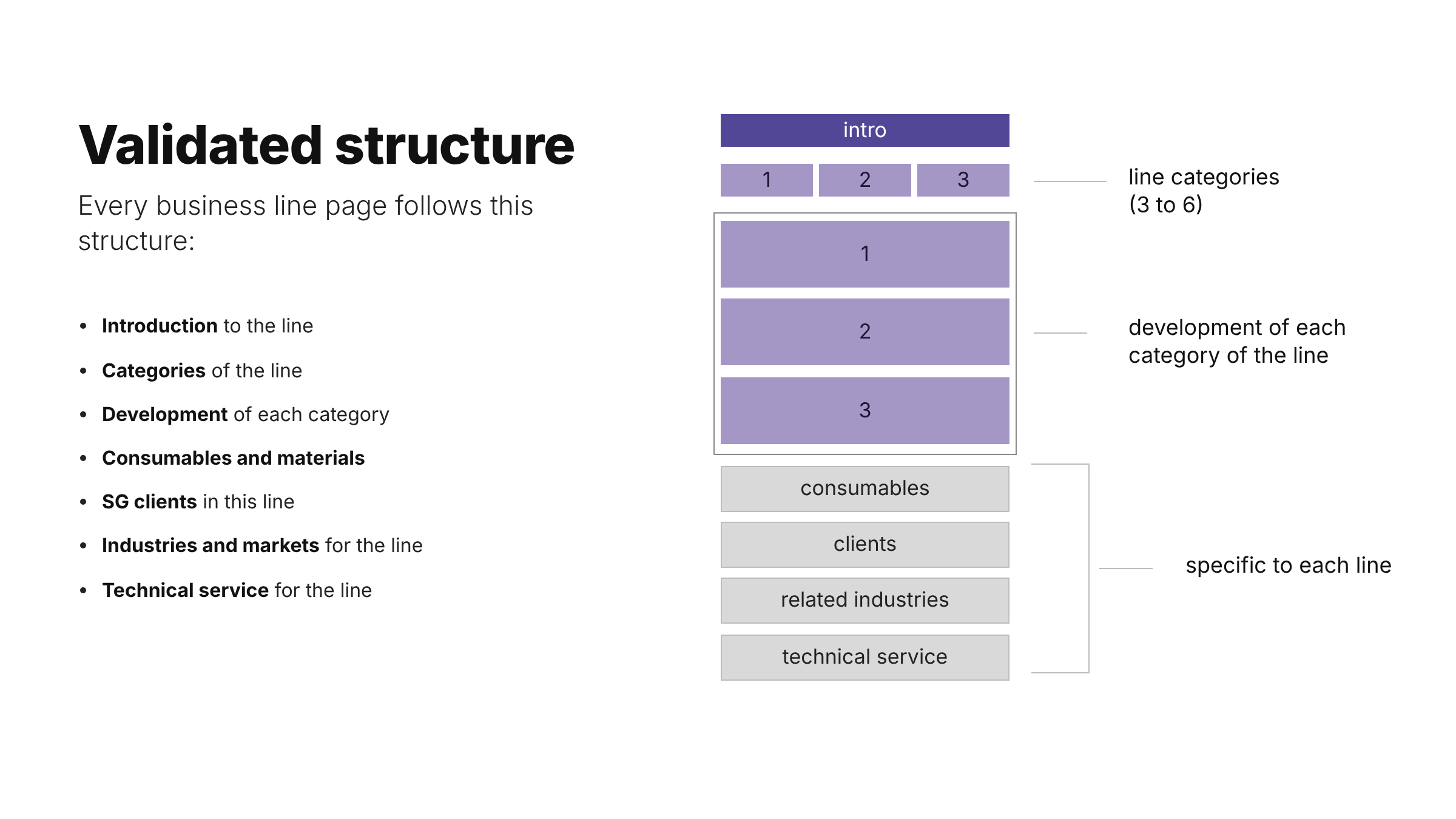
Each line page follows the same order:
The Home presents the full offer in one page: a clear headline, the brands available, one block for each business line, the one-stop partner message with its three pillars (machinery, technical service, supplies), client logos and the regional presence.
Example path: Home, Dental 3D, Dental 3D printer, Formlabs Form 4BL.
The project had four stages: user research, concept, production, and live site with adjustments. Each stage ended with a validation meeting with the client: research in February, concept in March, brand review in May and site structure in June 2025.
Co-creation with each line. Each business line leader sent the structure they had in mind for their page. We compared each one with our recommended structure, explained the differences, and agreed on one shared structure for all lines.
Content was the slowest part. Pages depended on texts and images from each line. When content was slowing the launch, we proposed to produce it ourselves, with only one person on the client side for the final approval.
Change with purpose. In August 2025 we presented the new brand to the whole company, with the before and after of the logo, signage, trade shows, uniforms and the website.

The 2025 brandbook documents the full identity and how to use it in every touchpoint:
Offset, flexography, inkjet, textile, 3D and dental 3D have different products, clients and languages. Before, offset took most of the attention and lines like dental 3D were almost missing.
The shared template gives every line the same structure: introduction, brands, categories, consumables, clients, industries and technical service. I configured most of these line and category pages. The result is a site where a dentist and a commercial printer can each find their own path, and where SG looks like one company.

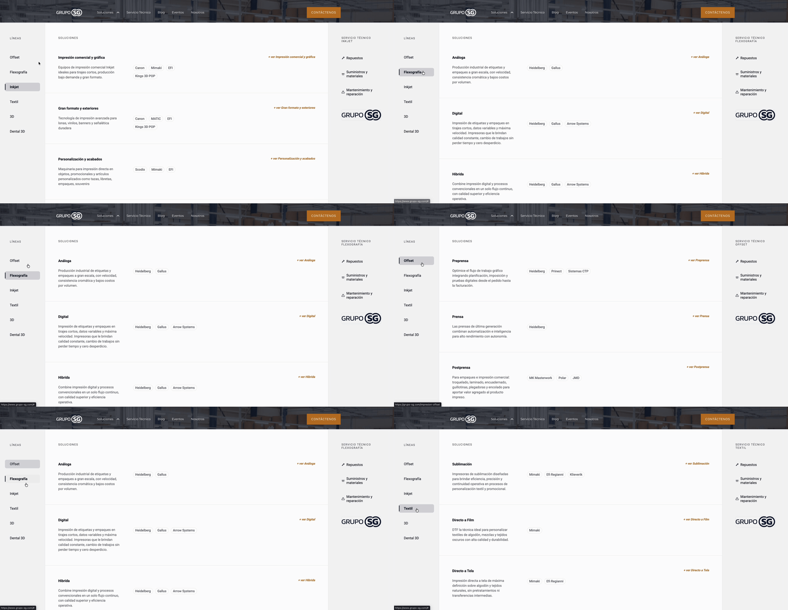
The old menu mixed dropdowns and clicks in the same items, which is bad practice, and had low contrast. The new mega menu shows the concept in the first click: all business lines with their categories, technical service in context, and contact always visible. It has its own mobile version.
Fast load and mobile optimization were part of the SEO starter from the proposal. mmm built the responsive version in Squarespace, with a mobile menu of its own.
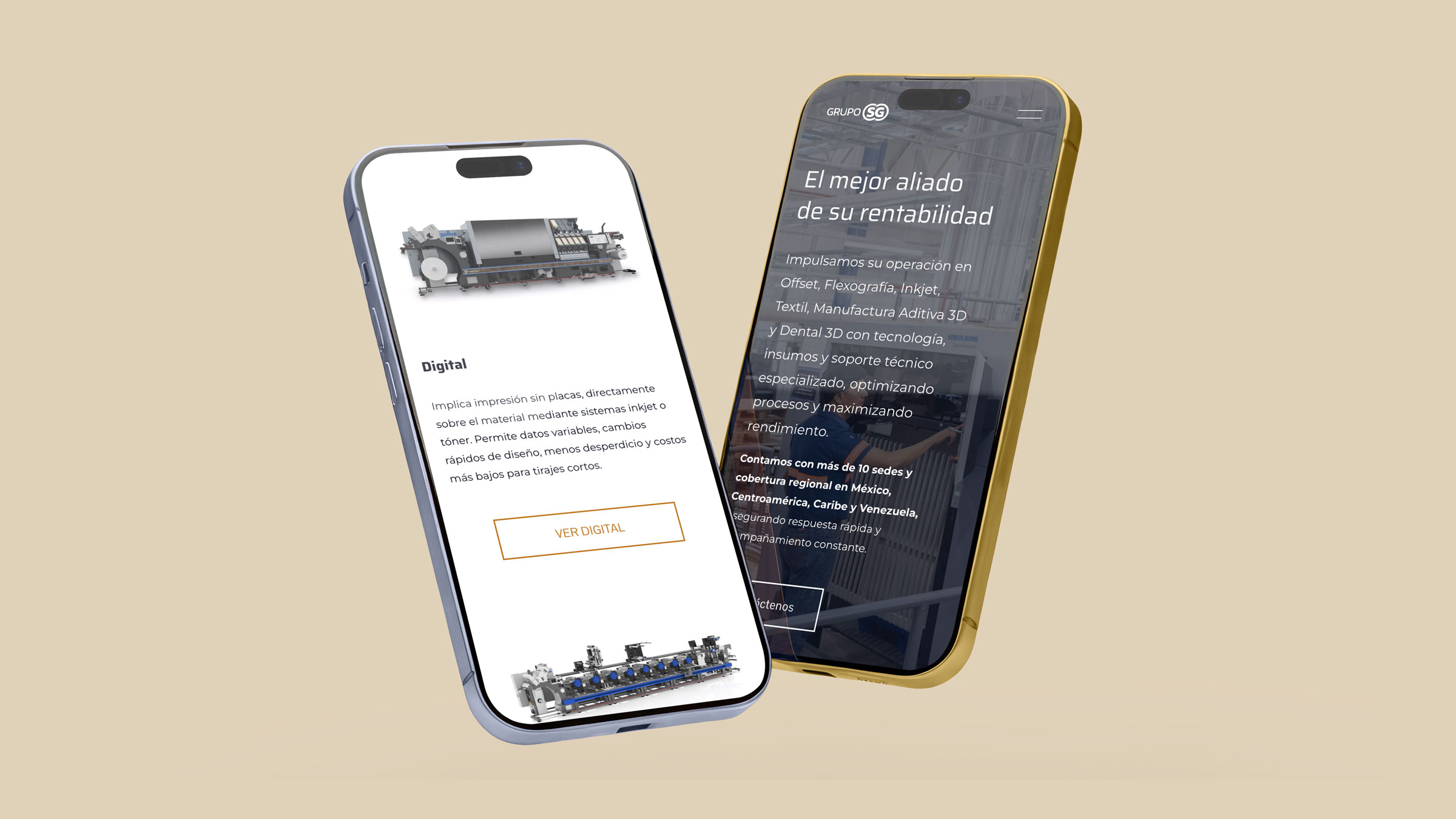


The site was built in Squarespace by mmm, and I configured most of the line and category pages. The SEO starter included clean and hierarchical URLs, like /impresion-offset instead of the old /offset-y-flexografia and headings with intention. Before, the site had more than 2,000 URLs and 5 sitemaps. The new one has 33 pages.
After the launch, the project continued with a digital strategy plan for social media, content and paid media in the region. In 6 months, interactions on Facebook and Instagram grew 10 times and the accounts gained more than 3,400 followers.
The new brand also ran on paid media in 7 markets, on Meta, LinkedIn and Google. Our team produced 161 creatives with the new identity. On Meta alone, they reached 6.1 million people and sent 279,879 clicks to the new website, so the architecture was tested with real campaign traffic.
he hardest part was creating hierarchy for a company this big: more than 10 countries and 6 business lines, each one with its own products, clients and language. One shared template helped a lot, but every line still needed its own content.
Collecting that content was the slowest part of the project. The people assigned to us inside Grupo SG were always very busy, and this delayed the launch. In the end, we offered to produce the content ourselves, with only one person for the final approval.
If I did a project of this scale again, I would systematize the content collection from day one: one template per business line with the exact texts, images and technical sheets we need, a deadline for each one and one owner per line.